The best subtitle fonts share 4 measurable attributes: high x-height for legibility at small sizes, open letterforms that prevent visual ambiguity between similar characters (such as ‘l’, ‘I’, and ‘1’), consistent stroke width for screen rendering, and WCAG 2.1 Level AA compliance at a minimum contrast ratio of 4.5:1.
The 10 subtitle fonts ranked in this article — Roboto, Arial, Helvetica Neue, Open Sans, Verdana, Tahoma, Tiresias Screenfont, Tiresias Infofont, Atkinson Hyperlegible, and Noto Sans — are evaluated against BBC Subtitle Guidelines (2022), the Netflix Timed Text Style Guide (2023), and EBU R 37 (European Broadcasting Union subtitle standard).
According to a 2022 study by the University of South Florida, sans-serif fonts increase subtitle reading speed by 12% compared to serif fonts in video environments. Subtitle fonts fall into 3 functional categories: broadcast-standard fonts (required for CEA-608, CEA-708, and EBU STL formats), accessibility-optimised fonts (designed for low-vision and dyslexic viewers), and general-purpose web fonts (suitable for SRT and VTT formats on digital platforms).
Subtitle Fonts: Top 10 Picks
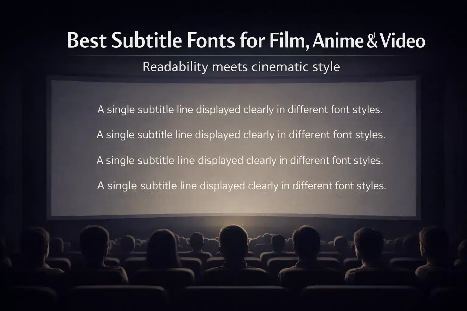
Unveiling the best subtitle fonts for an immersive visual experience in anime, games, and videos!
- Roboto (Sans-serif): A versatile choice with clarity and modern appeal, perfect for diverse content.
- Avenir Next (Sans-serif): Exuding sophistication, Avenir Next balances simplicity and elegance, ensuring readability.
- Helvetica Neue (Sans-serif): Timeless and widely used, its clean lines enhance legibility, making it a classic choice.
- Montserrat (Sans-serif): Ideal for digital media, Montserrat offers a sleek, contemporary aesthetic.
- Gotham (Sans-serif): Known for its sleek, urban vibe, Gotham brings a touch of modernity to subtitles.
- Pacifico (Script): Inject personality with Pacifico’s playful script, adding flair to casual or animated content.
- DIN (Sans-serif): A German classic, DIN combines simplicity with a touch of industrial charm.
- Bebas Neue (Sans-serif): Captivate audiences with Bebas Neue’s bold, impactful presence, enhancing title sequences.
- Comic Sans MS (Casual): Playfully casual, this font injects a light-hearted tone suitable for fun or comedic content.
- Lato (Sans-serif): A well-balanced choice, Lato provides a clean, friendly appearance, enhancing overall readability.
Roboto (Sans-serif)
With clean lines and modern simplicity, Roboto offers a sleek, professional vibe for digital platforms. Its versatile weights ensure readability, making it a perfect choice for websites and mobile apps. The balanced proportions and subtle curves create a harmonious visual experience, establishing Roboto as a timeless sans-serif font.
Avenir Next (Sans-serif)
Avenir Next exudes sophistication, embodying a perfect blend of elegance and readability. Its graceful curves and open forms make it ideal for conveying a sense of modernity, professionalism, and clarity in both print and digital designs. Avenir Next’s distinctive characters bring a touch of uniqueness to any project, leaving a lasting impression.
Helvetica Neue (Sans-serif)
Timeless and iconic, Helvetica Neue remains a stalwart in design. Its crisp, clear letterforms and neutral appearance make it a versatile choice for various applications. From editorial layouts to signage, Helvetica Neue’s simplicity fosters legibility and a sense of order, allowing content to shine while maintaining a classic and refined aesthetic.
Montserrat (Sans-serif)
Montserrat’s geometric design and subtle elegance make it a standout sans-serif font. Its clean lines and balanced proportions create a modern yet approachable feel. Montserrat is a reliable choice for conveying professionalism across diverse design projects, from branding to web design. The font’s versatility ensures a contemporary and polished look that resonates with a wide audience.
Gotham (Sans-serif)
Gotham’s bold, assertive presence makes a strong statement. With a modern and clean design, it radiates confidence and professionalism. Gotham’s versatility is showcased through its range of weights, providing flexibility for various design applications. Whether in print or on screen, Gotham captivates with its bold simplicity and distinctive character, making it a go-to choice for impactful visual communication.
Pacifico (Script)
Pacifico brings a playful and handcrafted vibe to any project. Its casual script style adds a touch of warmth and friendliness, making it perfect for creative endeavors. Pacifico’s fluid strokes and charming curves evoke a sense of informality and creativity, making it an ideal choice for branding, invitations, or any design where a touch of personality is desired.
DIN (Sans-serif)
DIN’s industrial-inspired design exudes a sense of strength and efficiency. With its geometric shapes and sturdy appearance, DIN communicates a no-nonsense attitude. Ideal for applications requiring a modern, practical look, DIN’s legibility and straightforwardness make it a reliable choice for signage, branding, and editorial design, conveying a sense of order and clarity.
Bebas Neue (Sans-serif)
Bebas Neue commands attention with its bold and uppercase letterforms. Its modern, geometric design radiates strength and confidence, making it a popular choice for headlines and impactful statements. Bebas Neue’s distinct character and straightforwardness convey a sense of authority, ensuring that your message is delivered with a powerful visual punch.
Comic Sans MS (Casual)
Infused with whimsy and a touch of nostalgia, Comic Sans MS is a casual font that brings a lighthearted feel to the design. Perfect for projects with a playful or approachable tone, its friendly, handwritten style adds a personal touch. Despite its polarizing reputation, Comic Sans MS remains a unique choice for conveying informality and injecting a sense of fun into various creative endeavors.
Lato (Sans-serif)
Lato strikes a harmonious balance between modernity and elegance. Its open forms and friendly curves contribute to a warm and inviting aesthetic, making it suitable for a wide range of applications. Lato’s versatility shines through in both print and digital contexts, ensuring legibility and visual appeal. With a contemporary yet timeless feel, Lato adds a touch of sophistication to any design project.
What Makes a Good Subtitle Font?
Full paragraph to write: A good subtitle font meets 4 technical criteria: high x-height (the ratio of lowercase letter height to cap height, ideally 0.65-0.75 for subtitle legibility), open letterforms that visually distinguish similar characters including ‘l’, ‘I’, ‘1’, ‘O’, and ‘0’, consistent or near-uniform stroke width that renders cleanly at small sizes on low-resolution displays, and a minimum contrast ratio of 4.5:1 against the background (WCAG 2.1 Level AA).
According to the BBC Subtitle Guidelines (2022), sans-serif typefaces with a minimum size of 22 pixels for standard HD broadcasts are required for all UK public broadcast subtitle tracks. The Netflix Timed Text Style Guide (2023) mandates proportional sans-serif fonts at a minimum of 100% opacity with a drop shadow or semi-transparent box for contrast.
All 4 criteria — x-height, letterform openness, stroke consistency, and contrast ratio — directly affect the reading speed of subtitle consumers, who typically have 3-7 seconds to read each subtitle card.
A Guide to Selecting Fonts for Subtitles and Closed Captions

Selecting the right font for subtitles is crucial for an immersive viewing experience. What font is used for subtitles matters; prioritize readability on diverse screen sizes.
Opt for clean, sans-serif fonts like Arial or Helvetica for easy legibility. Strike a balance between style and functionality—avoid overly decorative fonts that may hinder comprehension.
What is the Most Popular Subtitle Font?
Subtitle font in the world of anime is dominated by the widely acclaimed and popular choice, Helvetica Neue. Renowned for its clarity and readability, Helvetica Neue has become the go-to for subtitling in the industry. Its sleek, modern design ensures seamless integration with diverse anime genres, enhancing viewer experience. The font’s balanced proportions and clean lines contribute to legibility, even in fast-paced scenes.
Choosing the Right Fonts for Subtitles and Closed Captions
Selecting a good subtitle font is a crucial aspect of effective communication in audiovisual content. When choosing fonts for subtitles and closed captions, consider readability as a top priority. Opt for sans-serif fonts like Arial or Helvetica, as they enhance legibility on screens. Ensure a good subtitle font size, balancing visibility without overshadowing the scene. Style matters, too – simple, clean fonts work well.
Conclusion
In the realm of cinematic mysteries, what font is used for subtitles becomes the unsung hero, an unnoticed maestro shaping the viewer’s experience. The subtlety of this choice orchestrates emotions, guiding the audience through unseen nuances.
It’s the conductor of visual language, an unspoken communicator between frames. In the dance of pixels and serifs, the chosen font whispers its tale, influencing perception and weaving a narrative symphony.
Frequently Asked Questions
What is the best font for subtitles?
Roboto, Arial, and Helvetica Neue are the 3 most widely used subtitle fonts, with Roboto serving as YouTube’s default caption font and Tiresias Screenfont as the Ofcom-mandated standard for UK broadcast television subtitle tracks.
What font does Netflix use for subtitles?
Netflix does not mandate a single font name in the Netflix Timed Text Style Guide (2023); instead, Netflix specifies proportional sans-serif fonts at 100% opacity with a semi-transparent black background box — platform delivery systems typically render subtitles in the viewer device’s default sans-serif font (Roboto on Android, San Francisco on iOS).
What font does YouTube use for subtitles?
YouTube uses Roboto as its default caption font on Android devices and YouTube.com, applied automatically to both manual subtitle uploads (SRT/VTT) and auto-generated captions via YouTube’s speech recognition system.
What font size should subtitles be?
The minimum recommended subtitle font size is 18px for web video (720p), 22px for HD broadcast (1080p per BBC Subtitle Guidelines 2022), and 40px for 4K displays — sized to ensure readability within the 3-7 second average subtitle display window.
What is the best font for closed captions for accessibility?
Tiresias Screenfont is the leading accessibility-optimised font for television closed captions, designed by the RNIB and Loughborough University and mandated by Ofcom for UK broadcast; Atkinson Hyperlegible (Braille Institute, 2019) is recommended by the American Foundation for the Blind for digital subtitle accessibility.
What contrast ratio do subtitle fonts need?
WCAG 2.1 Level AA requires a minimum contrast ratio of 4.5:1 for subtitle text against its background; the BBC Subtitle Guidelines specify a minimum 5:1 contrast ratio for UK broadcast; white text (#FFFFFF) on a black semi-transparent background (rgba 0,0,0,0.75) is the Netflix and BBC standard.
Should subtitle fonts be serif or sans-serif?
Subtitle fonts are sans-serif in all professional broadcast and streaming standards — BBC Subtitle Guidelines (2022), Netflix Timed Text Style Guide (2023), and EBU R 37 all mandate sans-serif typefaces; a 2022 University of South Florida study found sans-serif fonts increase subtitle reading speed by 12% compared to serif fonts in video environments.
Is Comic Sans good for subtitles?
Comic Sans MS is excluded from all professional subtitle and captioning standards including the BBC Subtitle Guidelines, Netflix Timed Text Style Guide, and EBU R 37 — its irregular stroke width and low x-height ratio reduce legibility at subtitle reading speeds and it is not supported as a captioning font on any broadcast platform.
Does Circle Translations provide subtitle font formatting in its subtitle services?
Circle Translations provides subtitle translation and formatting services across 73 languages, delivering subtitle files in SRT, VTT, SCC, and EBU STL formats with font specifications compliant with BBC Subtitle Guidelines, Netflix Timed Text Style Guide, and WCAG 2.1 accessibility standards.
Subtitles
Professional and Accurate Subtitle Services for your Videos.
- Video subtitles specifically tailor-made for improving accessibility.
- Using highly experienced subtitlers with years of industry experience.
- Professionally written and expertly timed.
Translation
We help the world’s top companies translate their content in over 73 languages!
- We localize content for internet websites, games, travel, cryptocurrencies, and more
- Expand your global audience by adding different languages.
- We work only with qualified translators and experienced content creators
Audio translation
Ensuring full accessibility for Blind and visual impaired audiences.
- Visual descriptive events as they occur in the video.
- Working with top audio describers to perfectly describe what is happening on-screen
- Professional sound recording.